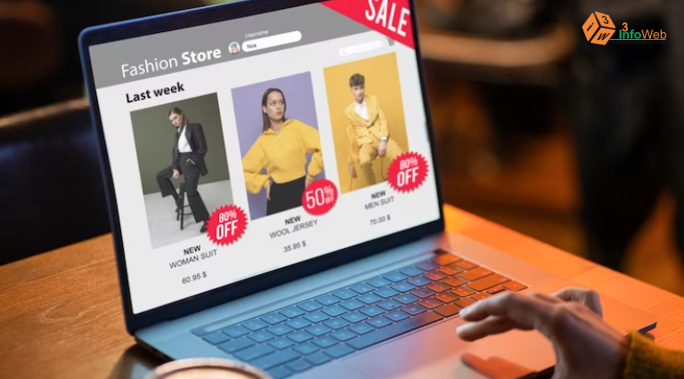
E-commerce Website Optimization Tips for Better Conversions
To make your online store work better and get more people to buy, try a few tricks. Make it easy for people to find things on your website and make your product pages look good and helpful. Speed up your website so people don’t get bored waiting. And make sure your website looks good on phones and tablets. Use customer reviews to show that your stuff is great, and make it simple for people to buy things. Keep an eye on data to make smart changes, and keep testing to make your website even better. These tips can help turn more visitors into happy customers.
1. Optimize Your E-Commerce Checkout Process
Research by Baymard found that nearly one in five people leave their online shopping carts because the checkout process is either too long or too confusing. To get more people to complete their purchases, you need to make sure the checkout is super smooth and simple. This way, customers won’t run into problems when they’re ready to buy, and it will help turn more visitors into happy buyers.
2. Add Trust Signals
Trust signals, like those little locks and badges you see on websites, make customers feel safer when shopping online. We noticed that people trust some parts of a webpage more than others, depending on how it looks. And, how safe a website feels to users often depends on their “gut feeling” and how secure the webpage appears visually. We ran lots of tests to figure out which trust badges people like the most when they’re about to make a purchase. If you want to see what we found, check out our detailed research on these trust signals for online shopping.
3. Clearly Display Product Reviews
User reviews are super important because they help people decide if a product is right for them. In our research, we found that almost everyone, up to 95%, reads reviews when checking out products. They usually look at two things: the average rating (how good the product is on average) and the number of ratings (how many people have given their opinions). So, make sure to show both of these for every product you have on your site. It helps customers make smart choices.

4. Optimize Websites for Mobile Users
Even though many websites work fine on mobile phones, some online stores aren’t that great on mobile. But now, since lots of people shop using their phones, it’s super important to make sure your online store works smoothly on mobiles. Making it easy for folks to browse and buy from their phones is one of the best ways to get more sales. You can find out about the common mistakes people make on mobile e-commerce sites in our list, which we put together after watching 289 people use them during our two-year study on mobile user experience.
5. Improve Product Photography
Pictures on a website are like the face of a brand. If you have good, clear pictures of your products, it makes shoppers feel more confident about buying from you. In our big tests, more than half of the people looked at product pictures first when they landed on a shopping website. But when the pictures were bad or you couldn’t zoom in to see details, lots of people left their shopping carts without buying. It’s a bit surprising that our research found only about a quarter of e-commerce websites show enough pictures for shoppers to really see what they’re buying. So, having great product pictures can make a big difference in getting more sales.
6. The Checkout Form Needs to Be Easy to Understand
When people buy stuff online, the forms they fill out during checkout should be simple and quick, whether they’re using a computer or a phone. The fewer fields they have to fill in, the better the shopping experience, and the more people will finish buying. Our recent research shows that most checkouts have about 12 fields, but you usually only need about 8. So, try making your checkout form shorter, and you might see more people completing their purchases. It’s all about making it easier for customers to buy from you.
Also Read : Google’s New Policy: Inactive Accounts Face Deletion Starting December 2023
7. Always Label Both Optional and Required Checkout Fields
This might sound a bit strange, but it’s really important. Only about a quarter of websites do it, but it can make a big difference.
When people are filling out forms to buy stuff online, they can get confused about which parts they must fill in and which ones are optional. To avoid this confusion, it’s a good idea to clearly mark both the fields that are necessary and the ones that are optional.
Our research found that not doing this causes problems like mistakes and slow checkouts, which can lead to people giving up on their orders. So, by making it crystal clear which fields are required and which aren’t, you can help customers get through the checkout process smoothly and boost your sales.
8. Be Careful How You Implement a Live Chat Feature
You’ve probably seen those little chat boxes that pop up on websites. They can be really helpful, but you need to use them wisely.
Our research found that when these chat boxes appear on their own and bother people, they can be annoying. But when people have questions and they click on the chat themselves to get answers, it’s really useful. So, if you use chat features, make sure people can choose when to use them, and they’ll find it helpful instead of annoying.
9. Websites Should Be Easy to Navigate
When people visit a website, they want to find what they’re looking for without too much clicking around. It’s like being in a store where everything is easy to find.
For example, have a button that says “View All” so people can see all the things you have on your site without clicking too much.
And on the main menu, show the different categories of products right away, so people don’t have to hover their mouse on a desktop or open more menus on a phone to find them. It makes shopping on your website much easier.
10. Have the Shipping Info and Return Policy in the Footer of Your Site
Buyers really care about return policies, and it can affect whether they buy from you or not. Surprisingly, some people check the return policy before even starting to shop to see if it’s worth it.
Now, where you put this info matters. Many sites have a special place for return policies, but some users always scroll down to the bottom of the page, thinking it’s where they’ll find it.
So, it’s a smart idea to make sure shipping and return info is easy to find on every page, like in the footer. This can make a big difference in convincing people to shop with you. It’s something many websites overlook but is crucial for e-commerce success.
11. Encourage Account Creation at the Right Time
When you’re shopping online, it’s a good idea to let people check out without making them create an account. Forcing them to create an account can make them give up on their order.
But, if you can convince them to make an account, it’s even better for both you and them. It can boost your sales.
The tricky part is getting them to understand that it’s a good thing. When you explain how having an account can make their shopping experience better, people are more likely to create one, even if they’re new to your site. So, it’s like a win-win when you show them the benefits.
12. Allow Users to Search Within Categories
When you have a list of products sorted into categories and you put a search box on top, it’s pretty common for users to think they can search within those categories. It makes sense from their perspective.
During one of our tests, a person tried to search, thinking it would find items in the category they were looking at. But it turned out the search was not connected to that category. It’s like a little mix-up, but it happens because the design can make people think they’re linked.
It’s pretty understandable why users might think they can search within a category. And actually, letting them do this can help boost sales, especially on mobile where the screen is smaller, and people prefer to see fewer product options at a time. So, it’s a smart move to let them search in a specific category on an e-commerce website.
13. Streamline Mobile Payment
Paying with your phone should be easy and straightforward. But, during our tests, we noticed that when it comes to choosing how to pay, things get tricky for mobile users. Most websites have many payment options, which can be confusing on a small screen. It’s like having too many choices at once, and people can get overwhelmed.
We’ve looked at what lots of companies do with their mobile payment options and found some good and not-so-good examples. So, if you want to make it easier for mobile users to buy from you, you can check out our tips to improve the experience and get more people to complete their purchases.
14. Hide Coupon & Promotional Fields Behind a Link
When people are filling out forms, they pay a lot of attention to fields that look empty. And if there’s a field for a “Coupon Code” that’s right there in the middle of the form, people will see it right away.
Now, this can be a problem. People often spend a lot of time searching for coupons, and when they see this field, they might think they’re missing out on a deal. It can make them feel like they’re paying more than they should. It’s like a constant search for discounts, and seeing that coupon field can make people worry they’re not getting the best price.
To fix this problem, you can hide the fields where you enter coupons and promotions behind a link. Put this link below the main part of the form, like the credit card details. This way, people won’t get distracted by the coupon field right away, and they can focus on completing their purchase first. It’s like putting the coupons behind a curtain until they’re ready to use them, so it won’t interrupt their shopping.
15. Product Descriptions Should Be as Clear as Possible
When you’re selling stuff online, your product descriptions should be just right – not too little, not too much. If people can’t find the info they want, they might leave without buying.
So, it’s a good idea to include details like what the product is made of, its size, and if it works with other things. This way, customers can easily find what they’re looking for, and they’re more likely to buy because they have the information they need. It’s about making your product descriptions helpful and convincing.
Also Read : Top 10 Web Development Trends to Expect in 2023, According to Experts And Data