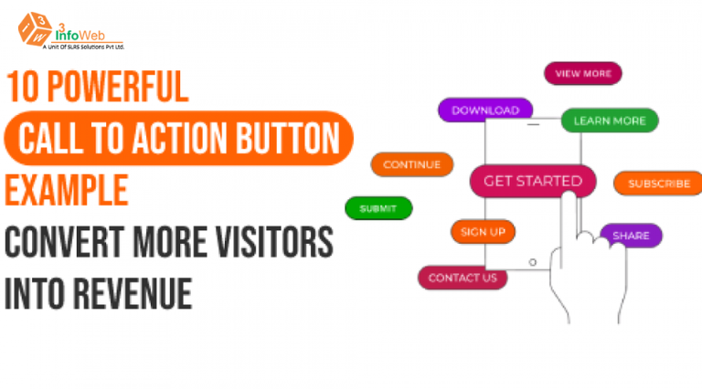
Effective Call-to-Action Strategies, Turning Visitors into Customers
Hey there, digital trailblazers! Ever wondered how those buttons and prompts on websites turn your clicks into something more? It’s all about mastering the art of the call to action (CTA). In this blog, we’ll unravel the mystery of creating super-effective CTAs that not only grab eyeballs but also turn curious clicks into full-blown conversions. Let’s dive into the world of simple, powerful tricks to make your website work its magic
Understanding the CTA Magic
Think of a CTA as a digital signpost, guiding your visitors on the exciting journey through your website. It’s not just a button; it’s an invitation to take the next step, whether it’s buying something, signing up, or diving deeper into what you offer.
1. Keep It Simple and Clear
CTAs should speak plain and simple. No fancy jargon or confusing messages. If you want them to shop, say “Shop Now.” If you want them to sign up, say “Subscribe Today.” The clearer, the better – no room for guessing.
2. Urgency is Key
Ever noticed those “Limited Time Offer” messages? That’s the urgency magic at play. Urgency nudges visitors to act quickly. Words like “Act Now” or “Limited Availability” light a little fire under your visitors, making them more likely to click.
3. Make It a Visual Treat
Your CTA needs to be a head-turner. Add a splash of color, a tempting button, or a snappy image. Visuals catch attention faster than words alone. Imagine it like decorating your shop window to attract curious passersby.
4. Speak Directly to Your Visitors
Make your visitors feel special. Personalize your CTAs based on what they like. A first-time visitor might see an inviting “Get Started” button, while a regular might get a tempting “Exclusive Deal” offer. Tailor-made for a more personal touch.
Also Read: User Experience (UX) Design Best Practices for Websites

5. Action Words are Your Allies
Choose words that pack a punch. “Discover,” “Explore,” “Join,” or “Transform” – these are like little motivational boosts. They make your visitors feel like they’re not just clicking; they’re taking action, and that’s powerful.
6. Mobile-Friendly or Bust
Don’t forget your mobile users! Make sure your CTAs work just as smoothly on phones and tablets. A wonky CTA on mobile is like a closed door – visitors won’t bother knocking.
7. Keep Testing and Tweaking
Think of your CTA as a fine-tuned instrument. A/B testing is like playing different tunes to see which one the audience loves. Use analytics to see which CTA hits the right notes – clicks, conversions, and bounce rates are your guiding sheet music.
8. Show Them the Goodies
Your CTA should be like a sneak peek into the goodies your visitors get. Whether it’s a discount, exclusive access, or problem-solving, make sure they know the awesome stuff they’re unlocking.
9. Keep It Consistent Everywhere
Imagine your CTA as a superhero with a signature move. Whether on your website, social media, or in emails, let it do the same magic everywhere. Consistency builds trust and makes your brand memorable.
10. Track and Learn from Your Metrics
Numbers tell stories. Dive into your analytics regularly. Check how many are clicking, what they’re doing after, and where they might be dropping off. These insights are like treasure maps guiding you to CTA gold.
Conclusion: Clicks to Conversions – Your Website’s Superpower
In the digital world, a smartly designed CTA is like your website’s superhero cape. It turns a casual click into a meaningful action, making visitors feel like active participants in the magic you offer. So, let your CTAs be the enchanting guideposts that turn clicks into conversions, and visitors into your delighted customers. With a sprinkle of persuasion, your website becomes the hero of its own story – turning curious clicks into conversion victories
Also Read: Choosing the Right Web Hosting: Shared, VPS, or Dedicated Server?